
Geographers from Kansas State University have created a map of the spatial distribution of the Seven Deadly Sins across the United States. How? By mapping demographic data related to each of the Sins.
Below are screenshots of the maps in standard deviation units; red naturally is more sinful, blue less sinful.

Wrath was calculated by comparing the total number of violent crimes — murder, assault and rape — reported to the FBI per capita.
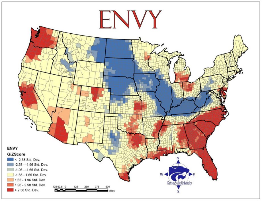
Envy was calculated using the total number of thefts — robbery, burglary, larceny and stolen cars.

Gluttony was calculated by counting the number of fast food restaurants per capita.

Greed was calculated by comparing average incomes with the total number of inhabitants living beneath the poverty line.

Lust was calculated by compiling the number of sexually transmitted diseases — HIV, AIDS, syphilis, chlamydia and gonorrhea — reported per capita.
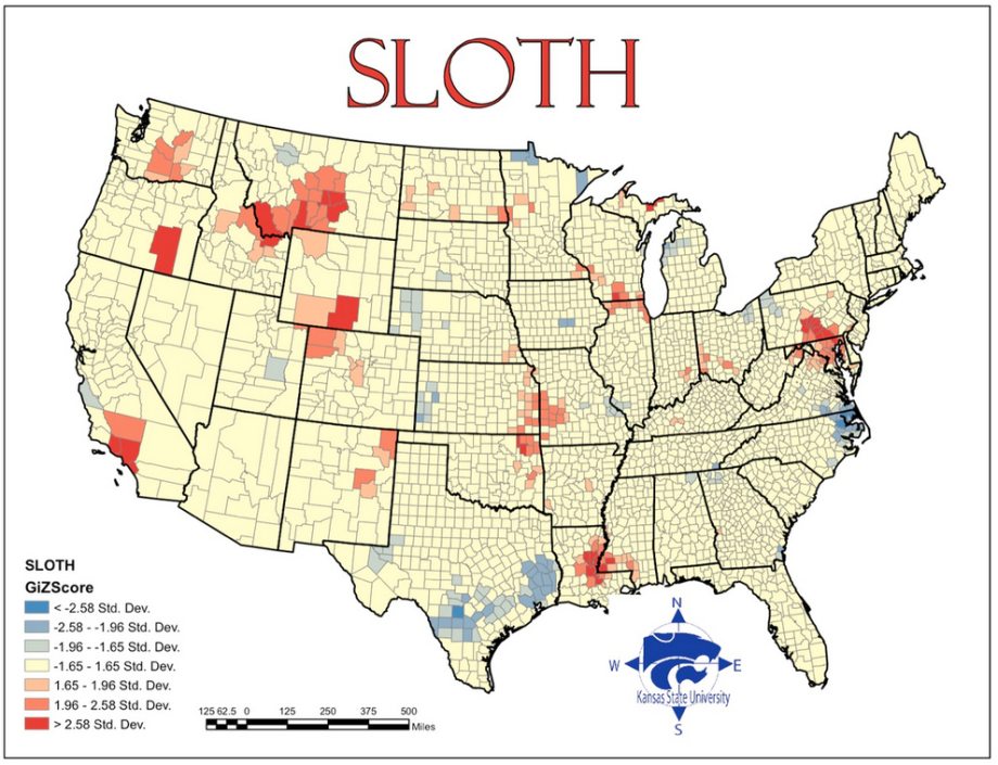
Sloth was calculated by comparing expenditures on arts, entertainment and recreation with the rate of employment.

And pride, lastly, is most important. The root of all sins, in this study, is the aggregate of all data.
Source: Memolition


How do I clear the search history in Bing how to delete bing history
ReplyDeleteBelow are screenshots of the maps in standard deviation units; red naturally is more sinful, blue less sinful.
ReplyDeleterun 3