Instagram artist Logo Chest likes to reveal the secrets behind popular brand logos. Take a look for yourself below, and you'll find out his drawings are hilarious:
Cisco
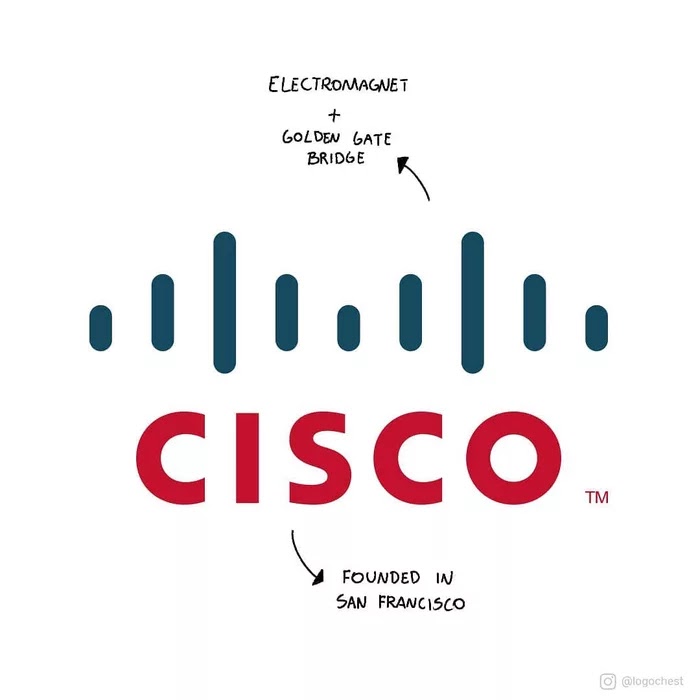
The company is an American multinational technology, a leader in networking for the Internet, which was founded in San Francisco. The blue lines represent not only an electromagnet but also the Golden Gate Bridge.
Toblerone
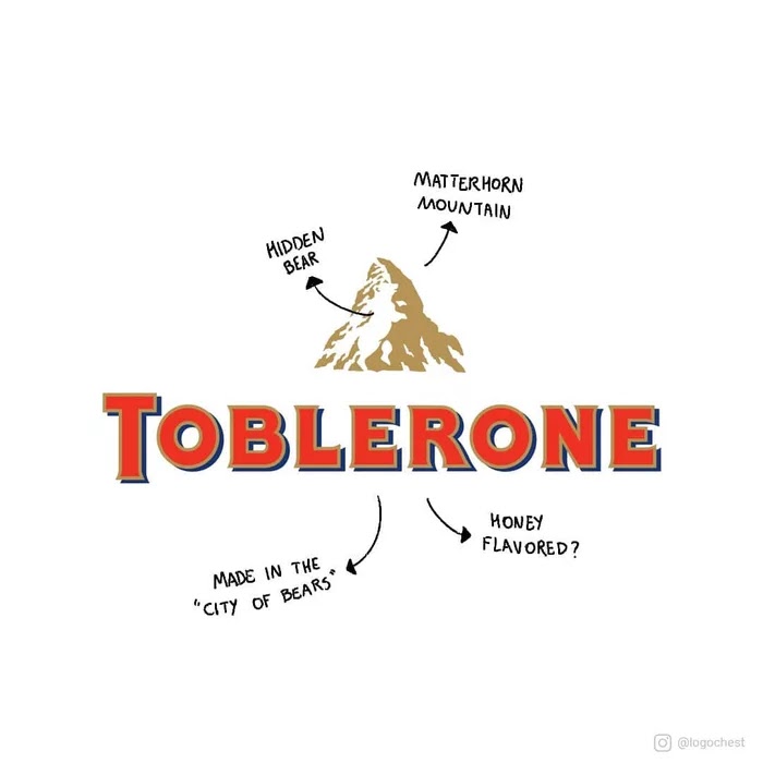
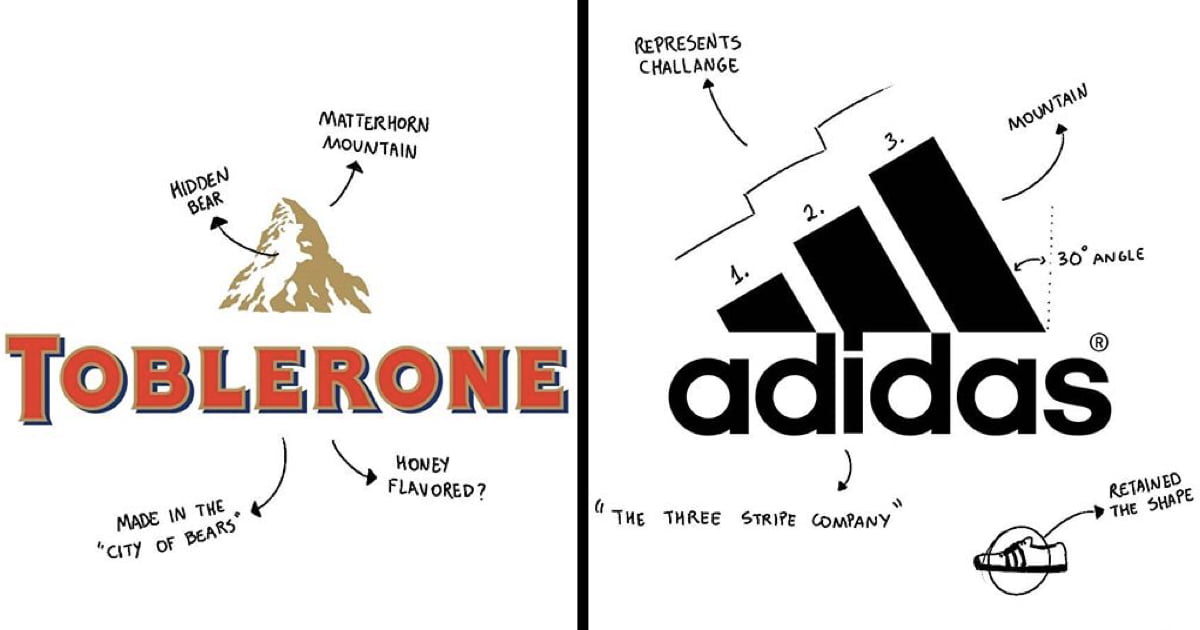
The Swiss chocolate bar brand features a mountain, representing the Matterhorn Mountain in Switzerland. Hidden in the middle, a bear, which symbolizes the sweet honey flavor present in the chocolates and the fact that they’re made in the “City of Bears.”
Airbnb

Back in 2014, Airbnb (Air Bed & Breakfast) launched a new brand identity, which was called Belong Together. The icon present in the logo is a mix of four other icons, representing people, places, love, and Airbnb.
Starbucks

Terry Heckler created the legendary logo, inspired by an image of a two-tailed mermaid (The Siren) from an old marine book dating back to 1500s. One of the founders once said that, like the ancient sirens, Starbucks was meant to lure coffee lovers from everywhere.
Adidas
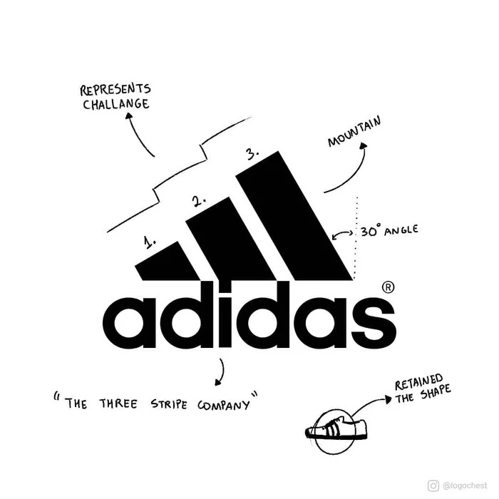
The three stripe company, such as the owner liked to call his business in the beginning, has a logo which resembles a mountain, like it’s challenging the customers to push themselves to the limit. The stripes, however, once served as a purpose, they bound the lateral sides of the shoe silhouette tightly together, to retain its proper shape.
McDonald's

In the 1960s’ two golden arches were part of the restaurant’s architectures, which were incorporated as the chains’ logo later on. The idea likens female breasts, arousing appetite and reminding of childhood.
VAIO

The meaning behind VAIO's logo represents both analog and digital technologies in its products. The letters “VA” resembles an analog wave, besides, “IO” retracts the numbers 1 and 0, from a digital signal or binary code.
Nvidia
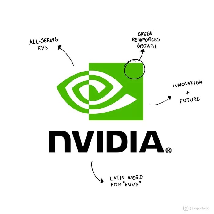
The company name is pronounced invidia, a Latin word for envy. Three years after the company was founded (1993), the all-seeing eye was chosen, reinforcing the "envious" qualities of the products and the constant search for innovation and future.
Beats
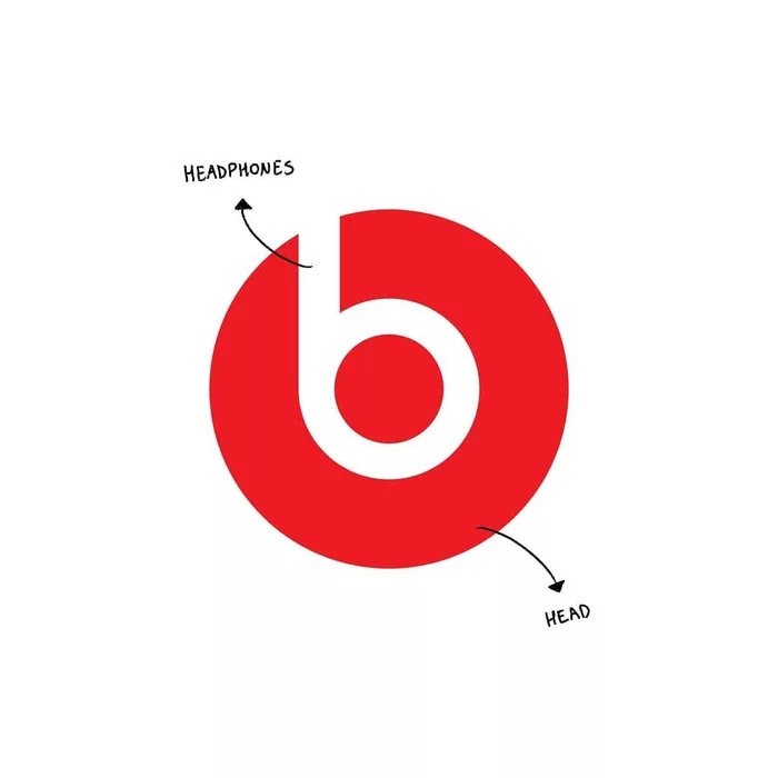
We usually see their headphones being wear by celebrities, but the logo is wearing one too. The letter "B" is an abstraction of a headphone, strategically positioned in the red circle which is representing a head.
Amazon

The logo has a smile which represents not only the happiness of the customers, who don’t need to leave their house to buy any products, but it shows that Amazon sells everything from A to Z.
Apple

Rob Yanov, the designer who created the logo, has an interesting explanation about the bite. He bought a bowl of apple and started drawing them over a week. After he bit one of the apples (as part of the experiment), accidentally realized that “bite” sounded the same as the computer term “byte.”
NBC
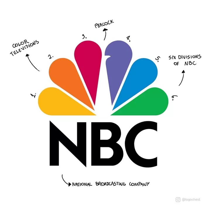
The broadcasting company has a logo with interesting meanings. Not only the six different colors of the peacock's feathers represent the six different divisions of NBC, but they are the representation of the time where color televisions started to arise.
LG
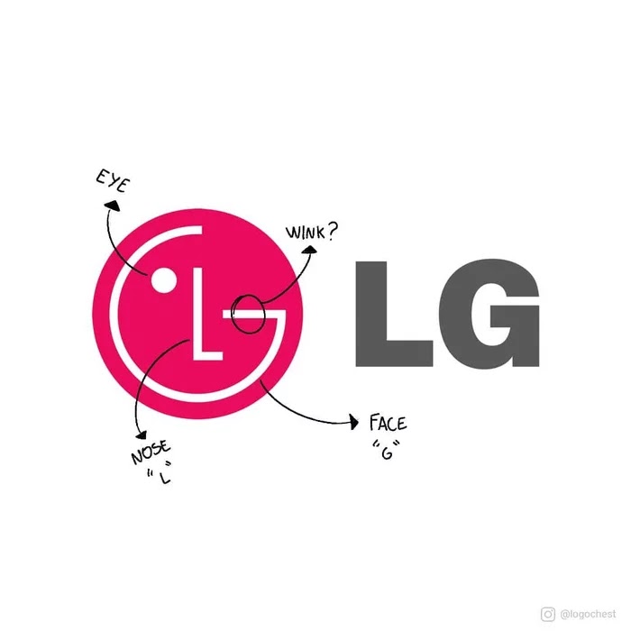
One of the most recognizable logos has a little detail that is hard to spot at first glance. Most people can see the letters “L” and “G” inside the red circle, but what most of them don’t know, is that they help to create a face, giving the brand a human touch!






COMMENTS