Maps are deceiving. You see, the surface of a sphere can't be represented as a plane without some form of distortion. Since the 1500s, scientists have been developing algorithms which would help transform the Earth into something flat and to do that, they use a method called projection. There's no right or wrong way to do it, everything depends on the purpose of the map. Yet, while every projection of the globe preserves one thing, it messes up the other. Area, direction, shape, bearing, distance, and scale are the primary properties map makers are constantly juggling. Most people tend to look at the Mercator projection.
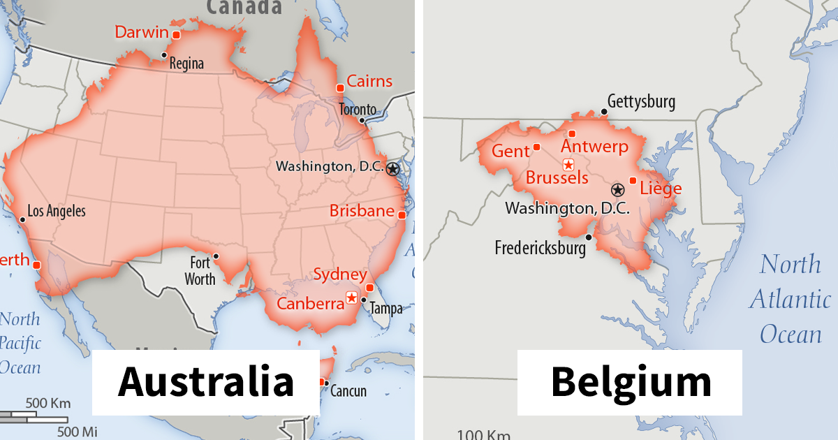
The projection is widely used for navigation because of the ability to represent lines of constant course. A line drawn between two points on the map would provide the precise angle to follow on a compass to travel between these two points. It also preserves the shape of countries. It is, however, less practical for world maps as the scale is distorted. This is where the Internet comes into play. Imgurian and map lover Mkyner compiled a series of overlapping maps that show countries from all across the world on top of the USA to give everyone a better understanding of just how huge it really is.
Most popular maps are created by using cylindrical projection. Imagine putting a cylinder over a globe and projecting each of the sphere's points onto the cylindrical surface. Then, if you unroll the cylinder, you end up with a flat rectangular map.
Flemish geographer and cartographer Gerardus Mercator created the Mercator projection in 1569. Gerardus preserved the direction of his map by varying the distances between the latitude lines and making them straight. Nevertheless, as with every map, there are drawbacks. For instance, on the Mercator map, Greenland and Africa look about the same size. Yet, compared to Africa, Greenland is 14 times smaller.
However, mapping services like Google Maps still use the Mercator because of its ability to preserve angles and shape. Close-up views of cities and roads are more accurate. A 90-degree right turn on the map is a 90-degree right turn on the street that you are driving on. And when you are close-up, the distortion is minimal. If you want, though, a map that shows the real size of things, fire up one that is created with a Gall-Peters projection.
Image credits: thetruesize

Population: 23,470,145, and all trying to buy a house in Melbourne it seems

Population: 4,545,627 people and about 30,000,000 sheep

Population: 142,122,776

Population: 208,846,892

Population: 1,296,834,042 Expected to pass China in population within a few years. Stripped bit near Winnipeg is occupied by China.

Population: 11,570,762

Population: 1,384,688,986
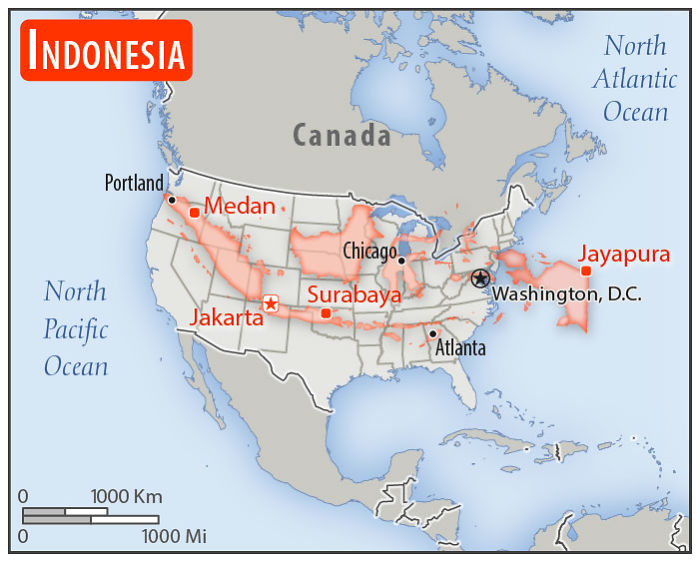
Population: 262,787,403 More than half the population is on that one island running from northern New Mexico to central Oklahoma. The big island in the upper Great Plains and that thing in the Atlantic are mostly jungle.

Population: 25,683,610 Ports: closed.

Population: 17,925,262

Population: 4,270,480 One of the coolest-shaped countries, like a Needler from Halo.

Population: 80,457,737

Population: 1,000 aka Holy See

Population: 38,420,687

Population: 126,168,156 and 1 Godzilla Bullet train will take you from Tokyo, Arkansas to Osaka, Texas in about 2.5hrs
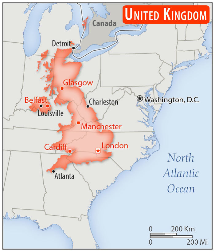
Population: 65,105,246

Population: 62,246,674 Giving South Carolina the boot.

Population: 44,694,198

Population: 5,537,364 May or may not exist.

Population: 343,518
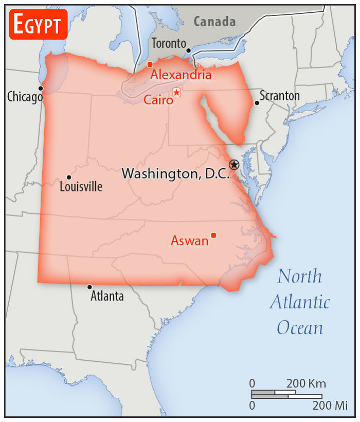
Population: 99,413,317

Population: 5,372,191 aka, Occupied West Sweden
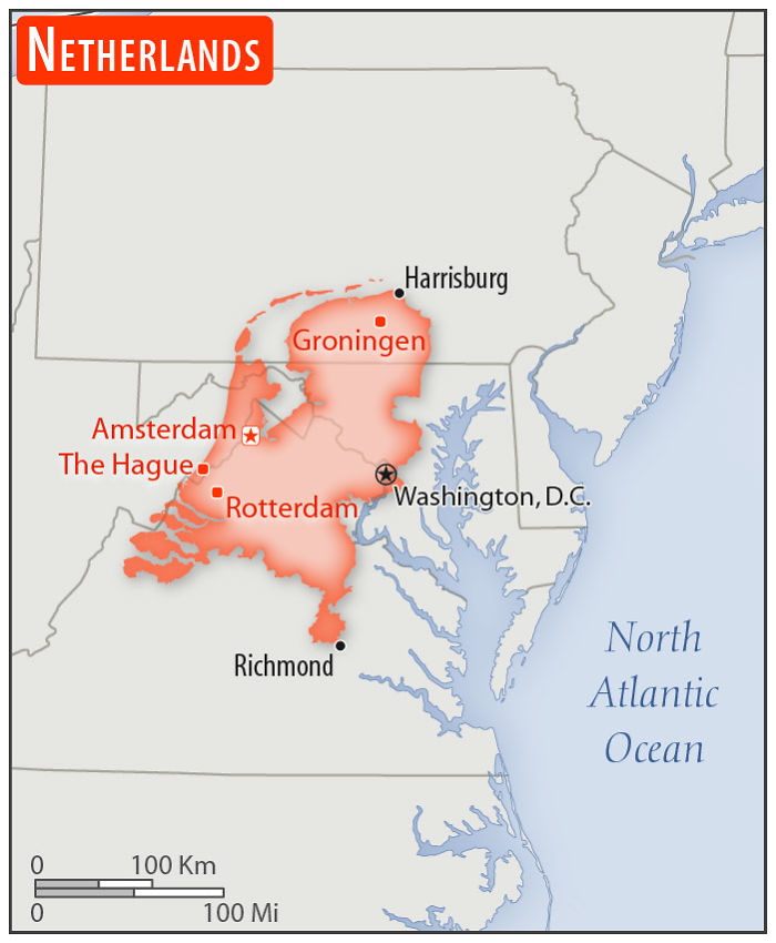
Population: 17,151,228

Population: 97,040,334

Population: 10,040,995 That's a lot of vikings.

Population: 81,257,239 *Constantinople
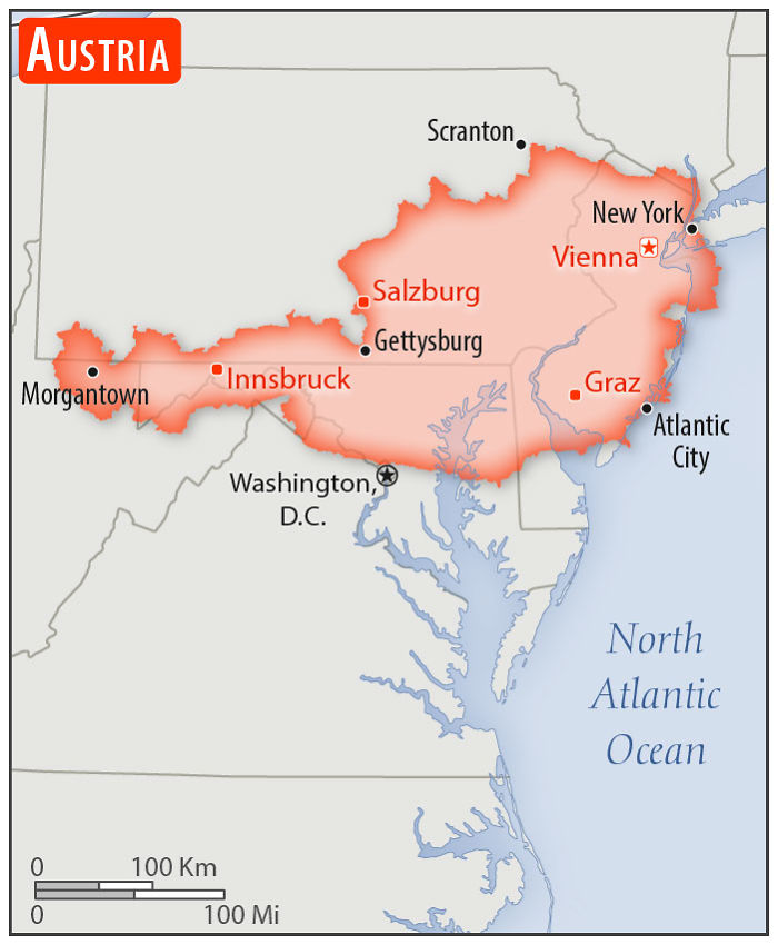
Population: 8,793,370

Population: 43,952,299 IIRC, the Russian-occupied part in the east is roughly New Jersey, Delaware, and a bit of Pennsylvania
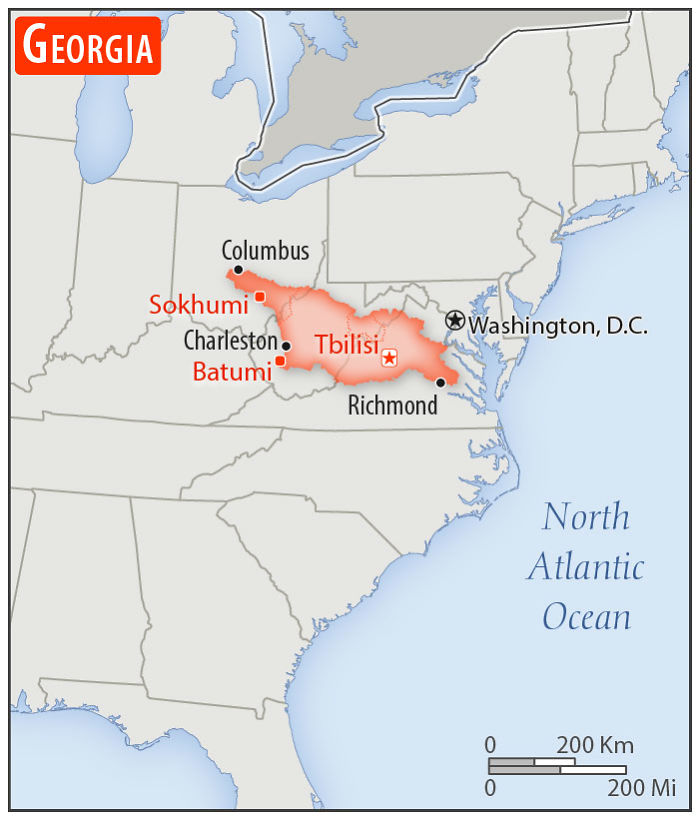
Population of the country of Georgia: 4,926,087 Population of the US State of Georgia: 10,519,475
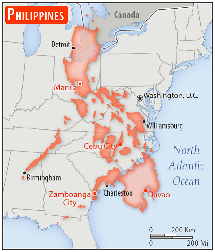
Population: 105,893,381


COMMENTS